Option A
The Trusted Partner
Clean, professional, and familiar. Your existing green-and-navy brand colours carried forward into a modern layout — reassuringly authoritative for established clients.
Walk through →A reverse-chronological showreel of every website Eureka has redesigned — three directions per client, walk through any of them.
Warm light-grey and copper — editorial, faithful to the book's spirit. Every one of the 140 inventions gets its own dedicated page.
Walk through →
Airy magazine style with cool blue-grey and teal — modern, category-led, with dedicated pages for the most iconic inventions.
Walk through →
Dark espresso canvas, warm cream text, copper accents — bold and immersive, leaning fully into the book's dramatic visual identity.
Walk through →
Clean and professional — a refined evolution of what you have, built to signal authority and trust to new clients searching for an accountant in Auckland.
Walk through →
Contemporary and approachable — a fresh identity that positions the firm as the go-to accountant for modern Auckland businesses and individuals.
Walk through →
Striking and memorable — deep brand colours with bold typography that sets Cockcroft Thomas apart from every other accountancy website in the city.
Walk through →
Clean, confident, professional. Your 60-year reputation front and centre — structured and easy to read.
Walk through →
Warm, contemporary, inviting. Balances approachability with clinical expertise — feels current without being cold.
Walk through →
High-contrast, striking, memorable. Makes an immediate impression — stands out from every other dental practice in Auckland.
Walk through →
What's there today — captured from kiwispapool.co.nz.
Visit the live site →
Clean, professional, and familiar — a refined version of what you have now. Clear hierarchy, calm colours, and everything in its proper place.
Walk through →
Bold, contemporary, and confident. Strong typography, fresh palette, and a layout that makes your services impossible to miss.
Walk through →
Dark, dramatic, and high-end. Navy canvas with bright accents — the kind of site that signals a business that takes its craft seriously.
Walk through →
Clean, professional, and familiar. Your existing green-and-navy brand colours carried forward into a modern layout — reassuringly authoritative for established clients.
Walk through →
Warm off-white tones with a bold purple accent open the palette up — confident and contemporary while staying grounded in your brand's green heritage.
Walk through →
Deep navy canvas with teal accents and reversed-out white text. Striking and memorable — signals a firm that punches well above its size.
Walk through →
What's there today — captured from daynightdrivingschool.com.
Visit the live site →
Clean and confident. Your brand colours, instructor credentials, and 90% pass rate front and centre — built for trust from the first glance.
Walk through →
Fresh and friendly. A lighter palette with modern typography that makes booking a lesson feel as easy as clicking a button.
Walk through →
Dark, dramatic, and memorable. Deep backgrounds with your red brand popping — a site that stands out from every other driving school in Auckland.
Walk through →
What's there today — captured from themobilephysio.co.nz.
Visit the live site →
A clean, professional site that feels like a natural refinement of what you have today — familiar to your existing patients, clear and trustworthy to new ones.
Walk through →
A modern, warm design with a distinctive accent palette — energetic enough to stand out, grounded enough for a health practice.
Walk through →
A bold, dark-canvas design that makes an immediate impression — sophisticated and memorable, the kind of site patients send to friends.
Walk through →
What's there today — captured from theprivateclinic.co.nz.
Visit the live site →
A clean, authoritative design that builds on the clinic's existing identity — warm, confident, and immediately trustworthy.
Walk through →
A brighter, more open layout that opens up the clinic's personality — fresh, accessible, and easy to navigate on any device.
Walk through →
A striking dark editorial look that sets the clinic apart — premium, memorable, and unmistakably specialist.
Walk through →
A clean, confident update — familiar feel, sharper presentation. Everything a visitor needs, right where they expect it.
Walk through →
A fresh, contemporary look that signals progress — bolder layout, livelier colour, built to make your work the hero.
Walk through →
A striking editorial direction — high contrast, unmistakable presence. For a signage company, your site should make a statement too.
Walk through →
Clean, confident, and immediately professional. Built on the trusted look clients already associate with Field Signs — refined and modernised.
Walk through →
A fresh take that opens up Field Signs to a wider audience. Contemporary layout, bold service cards, and a lighter feel that still says expert.
Walk through →
Warm, craft-led, and distinctive. Leans into Field Signs' handcrafted heritage and 40-year story — the kind of website people remember.
Walk through →
Clean, familiar, and professional. Keeps your red and white brand identity — just sharper, faster, and easier to call from. The safe upgrade.
Walk through →
A fresh direction that keeps your brand but opens it up with a contemporary palette. Stands out from every other locksmith site in Auckland.
Walk through →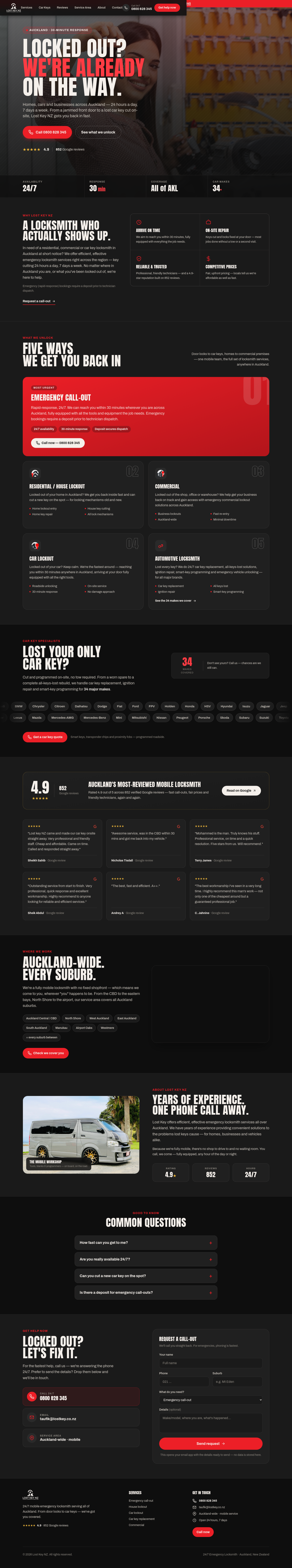
Dark, high-contrast, unmissable. Built for a business that operates at 2am — the kind of site that says you mean business before anyone reads a word.
Walk through →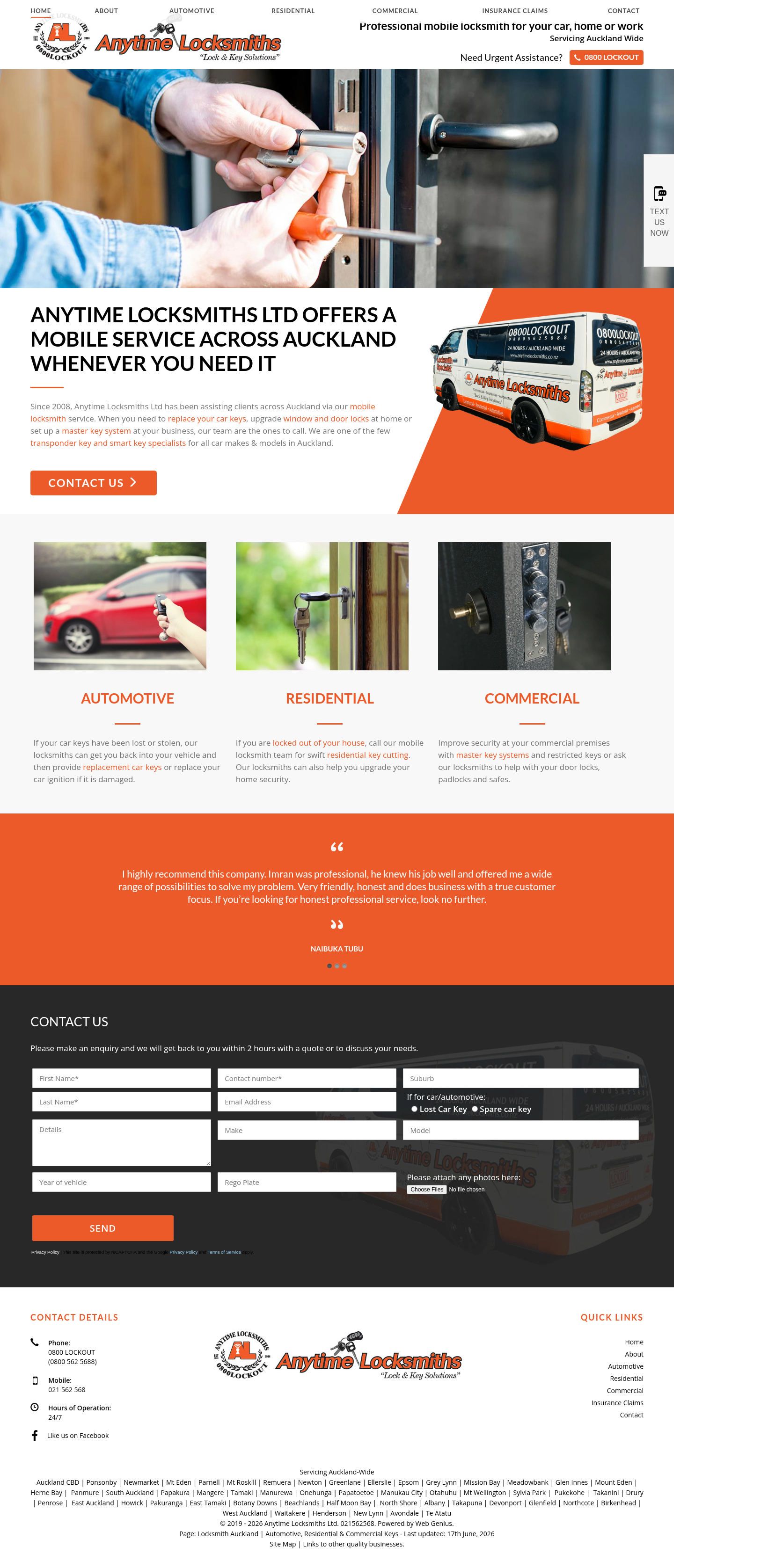
What's there today — captured from anytimelocksmiths.co.nz.
Visit the live site →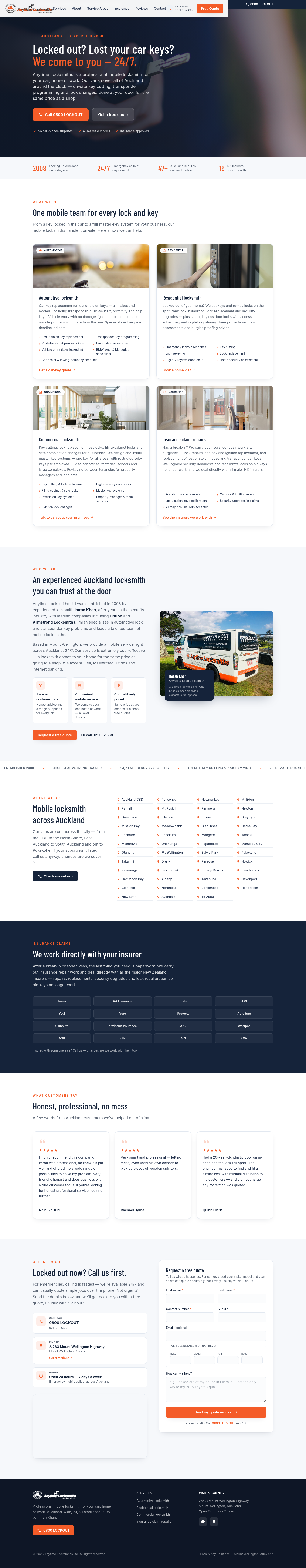
Option A
Clean, professional, and immediately familiar. Puts your credentials and 0800 number front and centre — the kind of site that earns trust at a glance.
Walk through →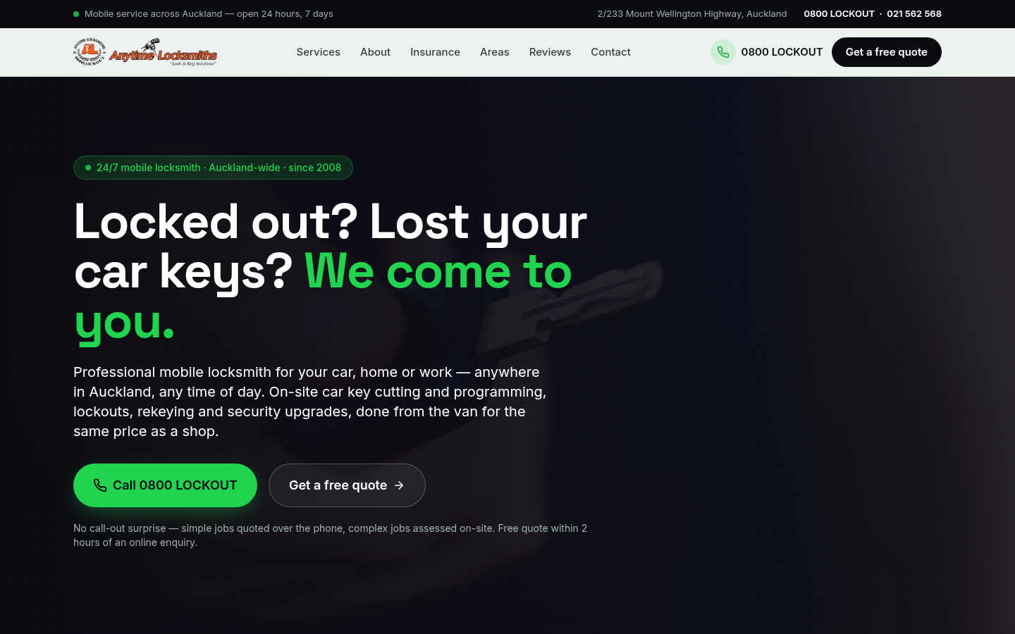
Option B
Contemporary layout with strong visual sections. Guides visitors naturally from "I need a locksmith" through to calling you — nothing in the way.
Walk through →
Option C
Bold, urgent, and built for emergencies. Dark editorial feel with the brand orange making your 24-hour availability impossible to miss.
Walk through →
Clean and professional — your brand colours, tidied up and made modern. Familiar and confident.
Walk through →
Fresh and bold — a contemporary layout that stands apart from competitors and projects authority.
Walk through →
Deep navy canvas, high impact — commands attention and signals that you work at the top end of the market.
Walk through →
What's there today — captured from surgicalrehab.co.nz.
Visit the live site →
Clean, authoritative, and easy to navigate. A refined take on your existing identity — light backgrounds, your brand colour used with confidence, and every credential clearly on show.
Walk through →
Contemporary and welcoming. A fresh palette that pairs your brand red with a cool accent, wide spacing, and a structure that guides every patient from first visit to booking request.
Walk through →
Dark, editorial, and unmistakably specialist. A striking design that positions your practice as the go-to for post-surgical care — confident enough to stand out from every other physio in Auckland.
Walk through →
What's there today — captured from aucklandsportspodiatry.co.nz.
Visit the live site →
Clean, white, authoritative. Lets the credentials and team do the talking — a restrained, professional aesthetic built for trust.
Modern and energetic. Bold type, vivid accents, and a sports-performance feel — designed to excite athletes and active patients alike.
Dark, immersive, editorial. Deep navy backgrounds and sharp typography — a striking look that commands attention and feels premium.
What's there today — captured from aucklandheatpumpservices.co.nz.
Visit the live site →
Clean, authoritative, and built for trust. White space, clear credentials, and a layout that says "registered electrician" at a glance.
Walk through →
Bold typography meets a clean off-white canvas. Confident and contemporary — stands out from every other trades website in Auckland.
Walk through →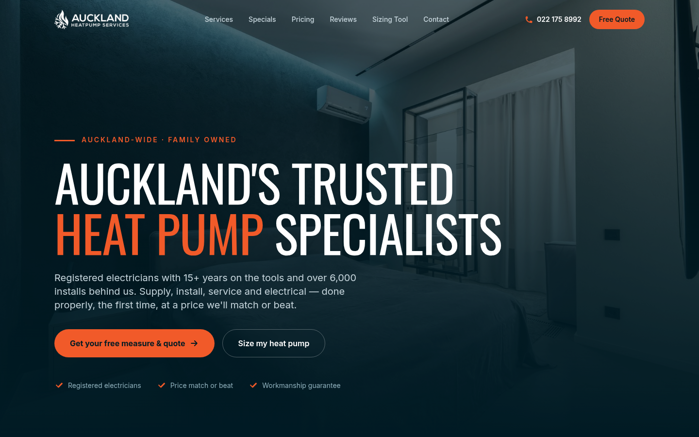
Deep navy, bold contrast, and a premium HVAC feel. Makes an immediate impression — the kind of site that makes people feel they're in good hands before they read a word.
Walk through →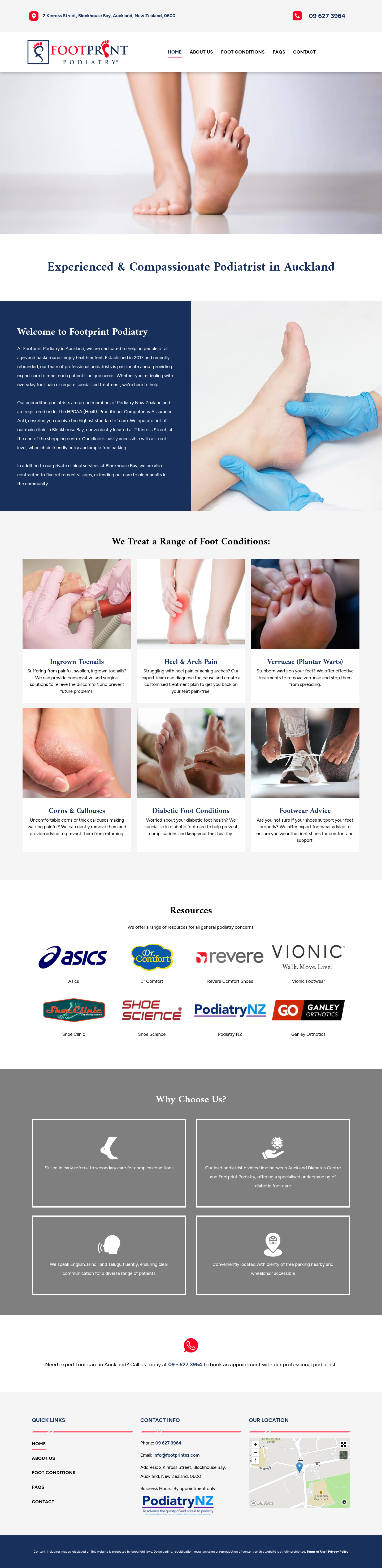
What's there today — captured from footprintpodiatry.co.nz.
Visit the live site →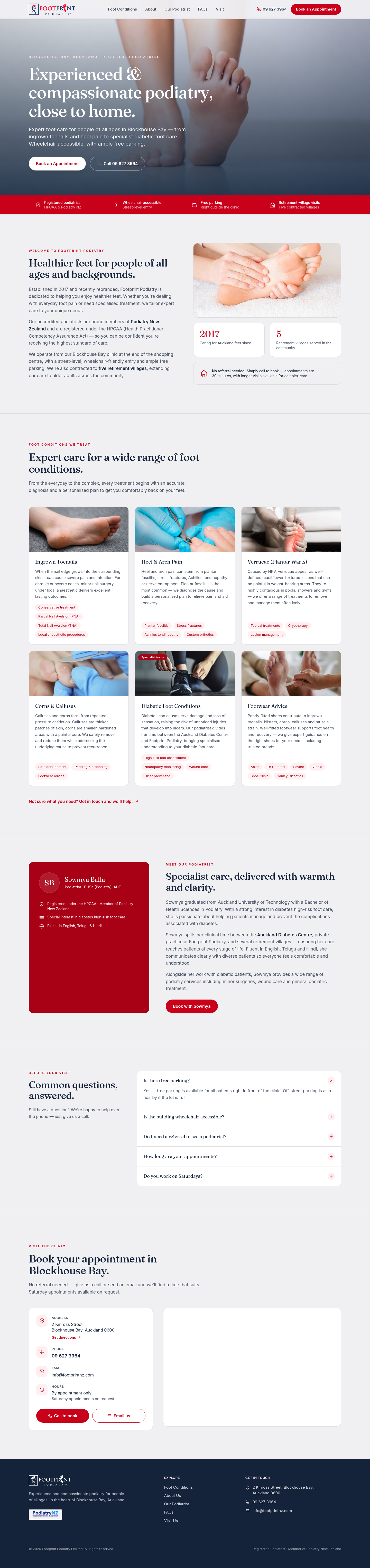
Clean and professional — white space, clear credentials, and a trustworthy tone that feels right for a healthcare practice.
Walk through →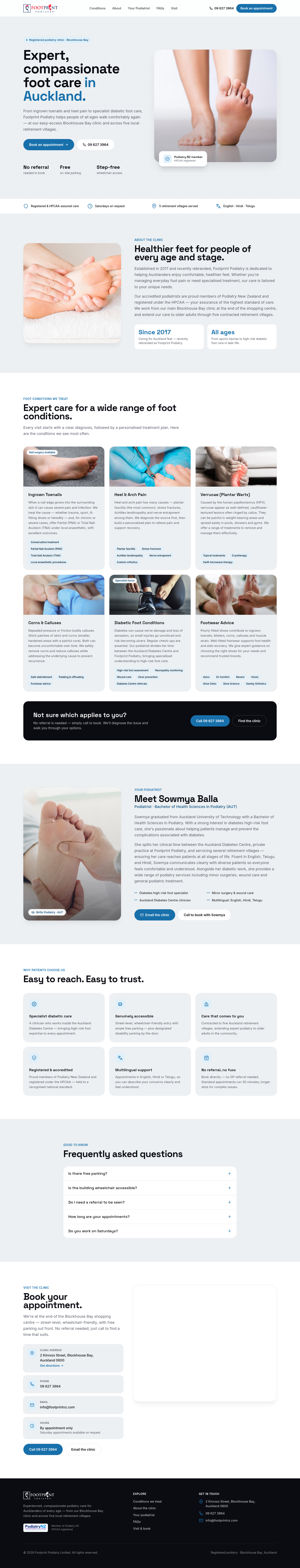
Contemporary and engaging — bold typography, clear patient journeys, and a design that stands out among Auckland clinics.
Walk through →
Confident and distinctive — navy and brand red, commanding authority, built to leave a lasting impression on every patient who visits.
Walk through →
What's there today — captured from mcbplumbing.co.nz.
Visit the live site →
Clean, authoritative, and immediately professional. White canvas, restrained typography, sage-green accents. Lets the credentials speak without noise.
Walk through →
Contemporary mono-plus-pop aesthetic. Cool off-white, near-black ink, electric violet accents. High contrast, fast-reading, and built for mobile-first.
Walk through →
Bold, brand-led, and memorable. Deep navy-midnight background with the MCB blue as a luminous accent. Stands apart from every competitor in the trade.
Walk through →
Clean, considered and confident — white space and sage-green accents let your award-winning work do the talking.
Walk through →
Editorial layout with warm off-white tones and a bold blue accent — precise, professional, and instantly modern.
Walk through →
Deep black canvas, warm cream type, and gold accents — premium and bold, like a Master Painters award in website form.
Walk through →
Clean, trustworthy, and easy to navigate. Classic layout that puts your services and contact details front and centre.
Walk through →
Confident and sharp. A contemporary minimal look that signals a premium operator ready for any job, from the Kumeu coast to the CBD.
Walk through →
High-impact and brand-forward. Dark canvas, strong colour, and commanding typography that stands out in any local search result.
Walk through →
What's there today — captured from aucklandroofingcontractors.co.nz.
Visit the live site →
Clean, professional, and easy to trust at a glance. A classic structure that puts your credentials and services front and centre.
Walk through →
Bold, contemporary, and built to stand out. A sharp layout that gives a strong first impression and drives visitors to get in touch fast.
Walk through →
Dark, dramatic, and unmistakably premium. A high-contrast design that makes your work look aspirational and your brand impossible to forget.
Walk through →
What's there today — captured from papakuraglass.co.nz.
Visit the live site →
Clean, white, and trustworthy. Puts your 45 years of experience front and centre with a calm, confident layout that works for both homeowners and commercial clients.
Walk through →
Crisp and contemporary with a bold blue accent. Designed to stand out in South Auckland search results and convert visitors into phone calls fast.
Walk through →
Dark, editorial, and impossible to forget. A deep forest-green canvas with your brand's lime-yellow as the sole accent — premium and distinctive in a sea of beige trade sites.
Walk through →
What's there today — captured from wcpestcontrol.co.nz.
Visit the live site →
Clean, confident, and built for trust. A white-and-forest-green design that says licensed, insured, and reliable from the first glance.
Walk through →
Bold and contemporary on a cool grey base. Stands out from every competitor in Auckland — unmistakably modern pest control.
Walk through →
Deep navy with vivid blue — authoritative and memorable. The kind of site that makes homeowners save the number before they even have a problem.
Walk through →
What's there today — captured from painterdecorator.co.nz.
Visit the live site →
Traditional craftsman-trade aesthetic. Cream background, APM red, and warm charcoal — timeless and reassuring for homeowners who value experience over flash.
Walk through →
Editorial Fraunces × Inter with APM red accent. Magazine-style portfolio grid that lets finished work do the talking — every photo earns its place.
Walk through →
Bold display type leading with "Twenty-six houses. One painter." Magazine-portfolio centrepiece that turns the gallery into the hero — for those who want to be remembered.
Walk through →
What's there today — captured from aucklandpanel.co.nz.
Visit the live site →
Restrained, established collision-shop aesthetic. Navy, bone, and warm gold — a site that signals authority and 30 years of trust without saying a word.
Walk through →
Editorial Fraunces headlines with clean Inter body text and a terracotta accent. Warm, approachable, and distinctive — stands apart from the typical trade-shop look.
Walk through →
Bold display type with persimmon and hazard-yellow accents on deep navy. High-contrast, unforgettable — the site your competitors definitely don't have.
Walk through →
What's there today — captured from thestoragehub.co.nz.
Visit the live site →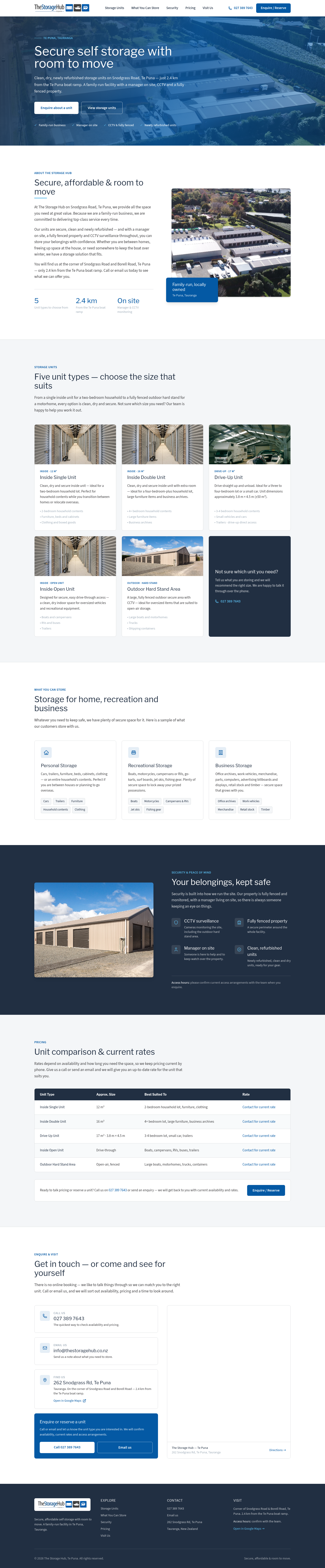
Clean, clear, and confident. Built to convert visitors into enquiries with a structured layout that puts unit types and pricing front and centre.
Walk through →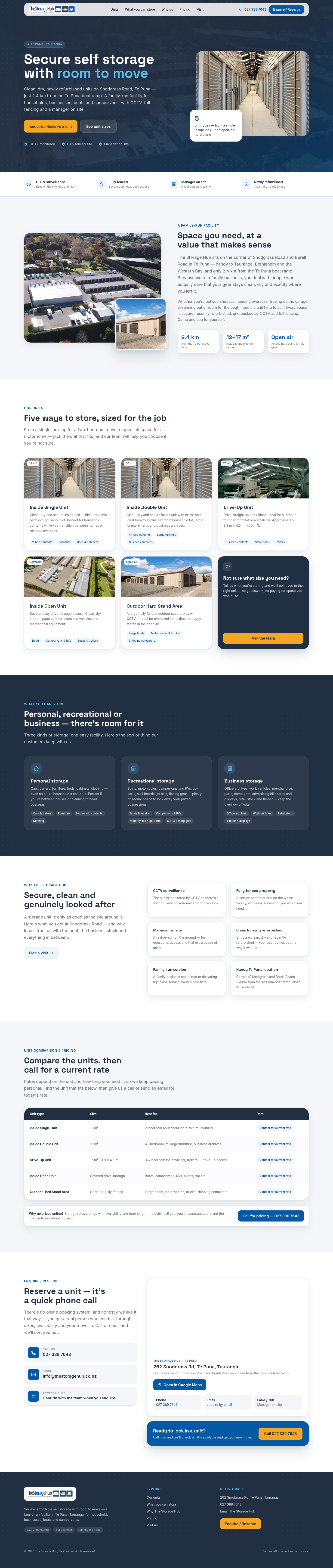
Fresh, friendly, and fast-loading. A contemporary layout with an online enquiry and reservation path so customers can act immediately, day or night.
Walk through →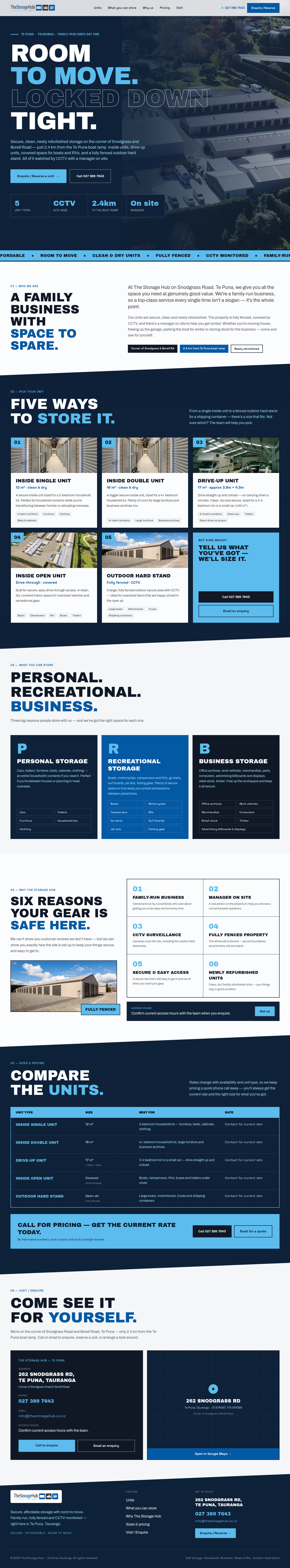
Striking and memorable. A strong visual presence that sets The Storage Hub apart from every other facility in the Bay of Plenty.
Walk through →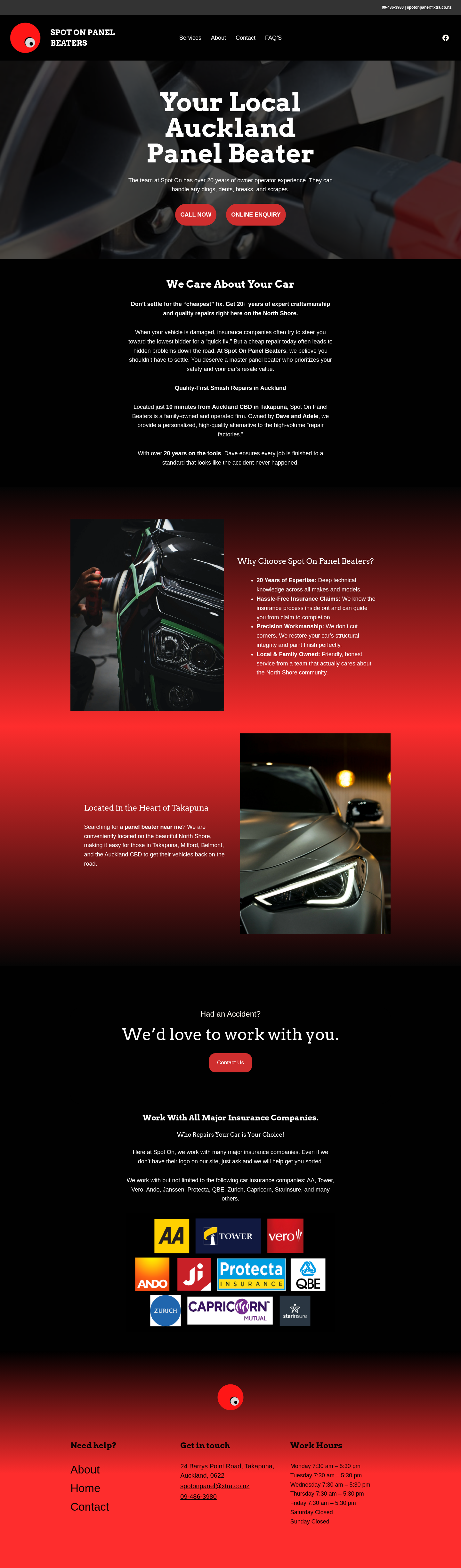
What's there today — captured from spotonpanelbeaters.co.nz.
Visit the live site →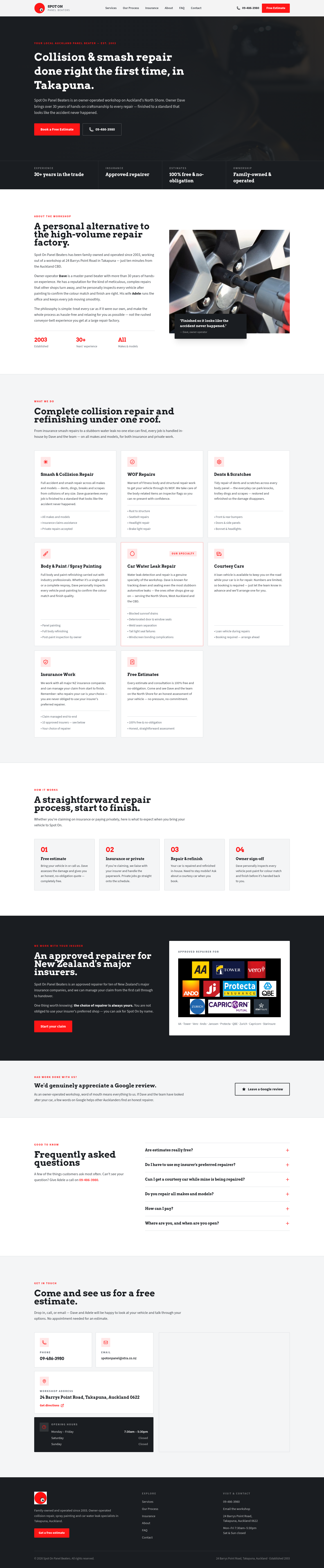
Warm, professional, and built for trust. Familiar layout with clear sections for services, credentials, and a persistent call-to-action — reassuring for first-time visitors.
Walk through →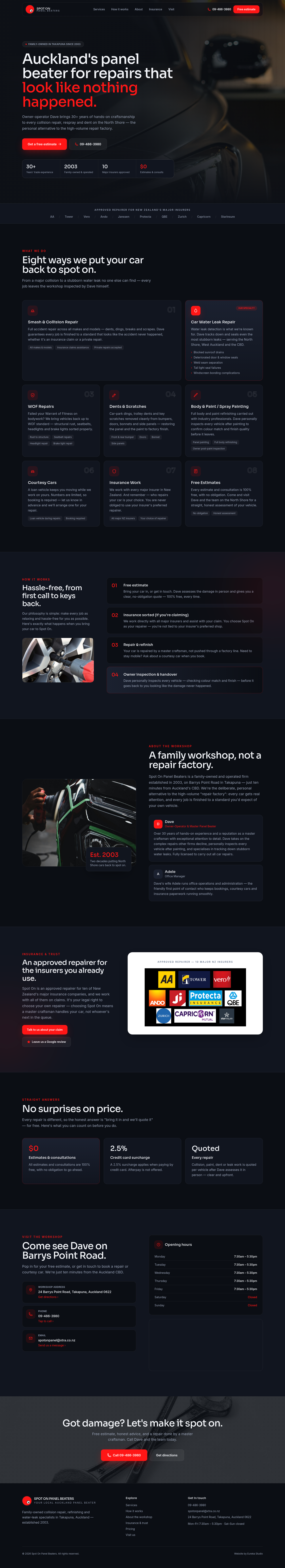
Clean, confident, and contemporary. Bold typography, strong imagery, and a modern layout that positions Spot On alongside premium Auckland repairers.
Walk through →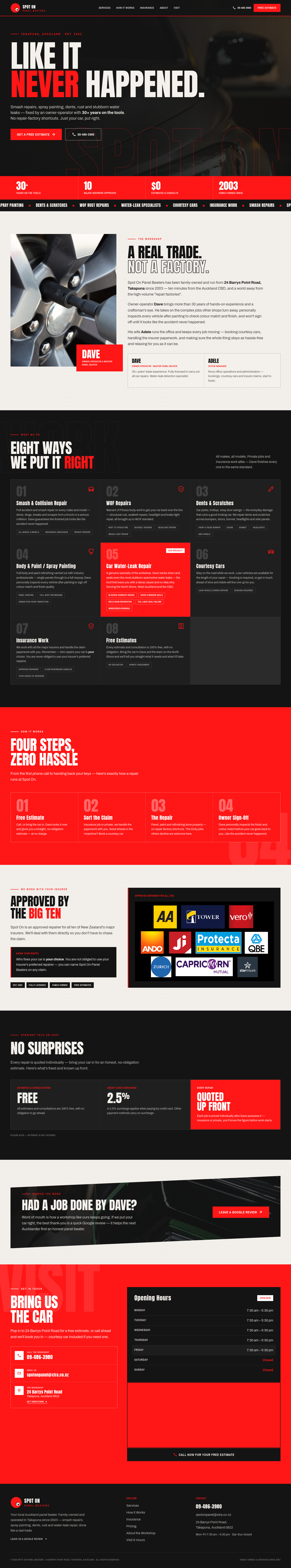
Dark, striking, and built for impact. A high-contrast design that showcases Dave's craft-led reputation — distinctive and memorable in a crowded market.
Walk through →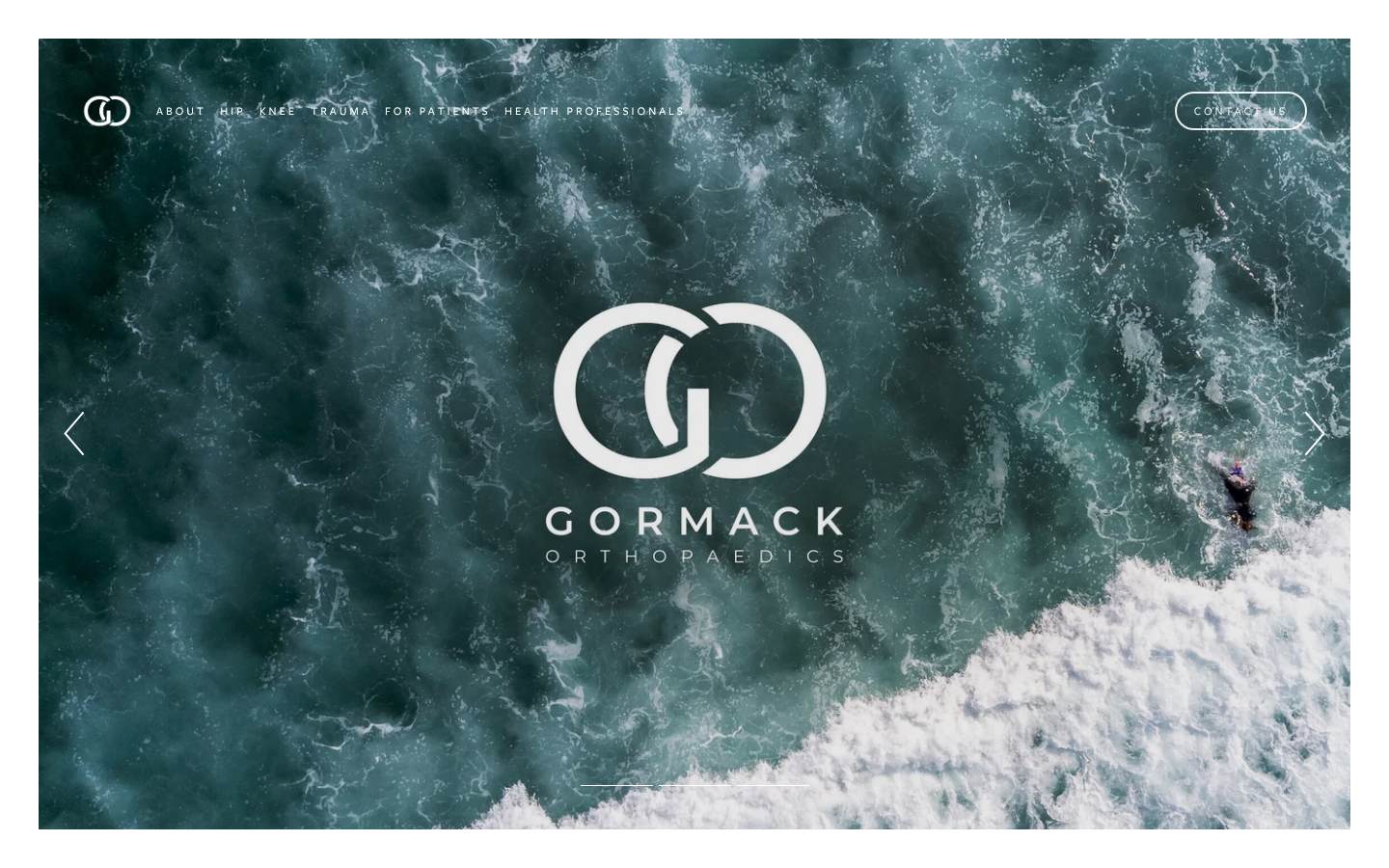
What's there today — captured from gormackorthopaedics.co.nz.
Visit the live site →
Clean, structured, and clinically confident — every credential front and centre, nothing superfluous. A site that signals expertise before a single word is read.
Walk through →
Contemporary layout with clear wayfinding — patients find their condition quickly, get the information they need, and feel at ease before they even call.
Walk through →
Bold, immersive, and memorable — a site that looks like the leading orthopaedic practice in Auckland, not just another clinic listing.
Walk through →
What's there today — captured from abovealldrivingschool.co.nz.
Visit the live site →
Clean, restrained, and familiar. White space does the work — easy to scan, easy to trust. The kind of site that never looks dated.
Walk through →
Contemporary and layered — dark backgrounds with gold and teal accents. Confident without being loud. Looks like a school that takes its craft seriously.
Walk through →
Bold yellow-poster energy with dramatic typography. Stops you mid-scroll. Exactly the kind of site learners show their parents and say "this is the one."
Walk through →
Restrained, refined, and traditionally law-firm in its aesthetic. Navy, cream, and gold across a 9-page structure that maps 1:1 to your current site.
Walk through →
Editorial and multi-page, with individual profile pages for Kristine, Campbell, Danielle, and Yunsi. Fraunces serif meets Inter sans across ~11 pages — navy, cream, and warm gold.
Walk through →
Bold and consolidated — Services, Team, Resources, and Contact each on their own dedicated page. Nothing dropped; everything clarified.
Walk through →
A warm, editorial design that leads with Woodcroft's century of heritage. Rich textures, honest photography, and structured product grids give trade buyers everything they need at a glance.
Walk through →
A clean, modern layout built around the product catalogue. Scannable categories, clear enquiry paths, and a professional tone that earns confidence with architects, builders, and trade buyers.
Walk through →
A bold, tactile direction that makes timber the hero. Full-bleed photography, strong typographic contrasts, and a confident presence that stands apart from any competitor in the category.
Walk through →
What's there today — captured from thomsongroup.co.nz.
Visit the live site →
Refined and professional — structured layout, deep navy palette, and your credentials clearly front and centre. Familiar, trustworthy, easy to navigate.
Walk through →
Contemporary and clean — bold typography, warm neutrals, and a project-led story that positions Thomson Group as a long-term strategic partner.
Walk through →
High-impact and distinctive — strong contrast, large project photography, and a confident tone that stands out in a competitive market.
Walk through →
What's there today — captured from theupholsterycompany.co.nz.
Visit the live site →
What's there today — captured from surfacetiling.co.nz.
Visit the live site →
Clean, authoritative, and built on trust. Warm neutrals and structured typography let Tony's 25 years of experience do the talking.
Walk through →
Modern and image-forward. Projects and workmanship take centre stage, with sharp contrast and confident spacing.
Walk through →
Bold and distinctive. A striking layout that positions Surface Tiling as East Auckland's premium choice — confident enough to stop a scroll.
Walk through →
What's there today — captured from plumbtight.co.nz.
Visit the live site →
Clean, professional, and instantly credible. Your credentials and reviews lead the page — built for customers who want reassurance before they call.
Walk through →
Bold layout, clear service tiles, and a persistent call button. Designed for busy people who want to find the right service and call in two taps.
Walk through →
High-contrast, striking, and memorable. Stands out from every other plumber in Auckland — for a business ready to own its market.
Walk through →
What's there today — captured from pawfectstudio.co.nz.
Visit the live site →
Clean, professional, and quietly confident — built around trust and clarity for first-time visitors.
Walk through →
Warm and contemporary — bold imagery, easy booking, and a layout that guides every visitor toward a decision.
Walk through →
Distinctive and memorable — high-impact visuals and an unmistakable personality that sets you apart in Howick.
Walk through →
What's there today — captured from mobilewelding.co.nz.
Visit the live site →
A clean, confident layout that honours 30 years of heritage. Bold typography and a professional tone that speaks directly to project managers, engineers, and procurement teams.
Walk through →
A contemporary trade-business aesthetic with strong visual hierarchy, service cards with real project photography, and a frictionless call-to-action flow for busy site managers.
Walk through →
A striking dark-tone design that matches the raw energy of the work itself. High-contrast photography, bold service categories, and an authoritative presence that stands out in the industry.
Walk through →
What's there today — captured from hdcontractor.co.nz.
Visit the live site →
Conservative, authoritative look that builds on what you have. Every one of your 35 services gets its own dedicated page — the same depth as today, rebuilt properly with clear headings, real images, and trust badges throughout.
Walk through →
Clean, confident, contemporary. Four service-category pages organise everything neatly, plus nine dedicated pages for your highest-value services. Faster to navigate, easier to update, and sharper-looking on every device.
Walk through →
Striking, high-impact, stripped to what matters. Four category pages each hold all their service content in one place — the leanest structure to maintain, and the one most likely to make someone stop scrolling and call.
Walk through →
What's there today — captured from fresheffects.co.nz.
Visit the live site →
Clean, warm, and professional — built for trust. A quiet layout that lets the quality of the work speak for itself.
Walk through →
Bold and confident — a contemporary layout with strong calls to action and a clear visual hierarchy throughout.
Walk through →
Striking and editorial — full-bleed imagery, expressive type, and a layout that makes an immediate impression.
Walk through →
What's there today — captured from electricfeel.co.nz.
Visit the live site →
Clean, confident, and straightforward. Strong trust signals and clear calls to action — familiar enough for anyone to navigate immediately.
Walk through →
Bold typography and a contemporary layout that stands apart from the crowd. Confident, energetic, and built to convert.
Walk through →
A high-impact design that makes a strong first impression. Electric Feel's yellow-and-black identity pushed to its boldest expression.
Walk through →
What's there today — captured from dovetailrestorations.co.nz.
Visit the live site →
A warm, editorial layout that leads with 35 years of heritage. Earthy tones, generous whitespace, and your team's faces front and centre.
Walk through →
A clean, structured design that lets your project photography do the talking. Easy to navigate, works beautifully on any device.
Walk through →
A bold, premium presence with dramatic contrast and full-bleed before/after imagery — positions Dovetail as Auckland's finest.
Walk through →
What's there today — captured from byaccident.co.nz.
Visit the live site →
Refined and authoritative — a professional layout that builds confidence with credentials, insurance approvals, and decades of expertise front and centre.
Walk through →
Clean and contemporary — balances approachability with professionalism. Ideal for customers who want clarity: what you do, who does it, and how to get started.
Walk through →
High-contrast and striking — leans into the automotive energy of the brand. Makes a strong first impression and stands out from every competitor in the area.
Walk through →
What's there today — captured from blacksteel.co.nz.
Visit the live site →
Clean, credential-forward, and built to win tenders. Puts your SFC Level 3 status and 30-year track record front and centre in a structured layout that procurement managers trust.
Walk through →
Bold imagery meets precision layout. Your project portfolio leads, with award wins and certifications woven in naturally. Speaks to architects, builders, and homeowners alike.
Walk through →
Dark, dramatic, and unmistakably steel. A striking visual identity that sets Black Steel apart from every competitor in Auckland — memorable, modern, and made to convert.
Walk through →
What's there today — captured from bayhandtherapy.co.nz.
Visit the live site →
Clean, confident, and grounded in 18 years of expertise. Familiar structure — sharpened and modernised.
Walk through →
Bold typography and generous whitespace put your team and results front and centre.
Walk through →
A distinctive, editorial direction that sets Bay Hand Therapy apart in a crowded health market.
Walk through →
What's there today — captured from aucklandtreecare.co.nz.
Visit the live site →
Clean, confident, and easy to read. A structured layout that puts your credentials and services front and centre — built to earn trust quickly.
Walk through →
A fresh, contemporary design with bold typography and strong visuals. Balances personality with professionalism in a way that stands out locally.
Walk through →
High-contrast, striking imagery with a layout that commands attention. Designed for the business that wants to make a clear statement in a competitive market.
Walk through →
What's there today — captured from aucklandpoolservices.co.nz.
Visit the live site →
Clean, confident, and familiar. The same reassuring feel as a well-run local business — just sharper, faster, and easier to act on.
Walk through →
A contemporary layout that puts your services and pricing front and centre. Designed for people who want answers quickly and contact you on mobile.
Walk through →
A bold, striking design that positions James as the go-to pool specialist in Auckland — high impact, instantly memorable, built to stand out.
Walk through →
What's there today — captured from aucklandlock.co.nz.
Visit the live site →
Clean, authoritative, and immediately reassuring. Built to convert urgent callers — every section puts your credentials and phone number front and centre.
Walk through →
Bold layout with clear service navigation. Works equally well for emergency calls and considered purchases like digital locks, access control, or safes.
Walk through →
High-impact, visually striking. Positions Auckland Locksmiths as the premium choice — ideal if your goal is to attract more commercial and high-value residential clients.
Walk through →
What's there today — captured from aucklandinsulation.co.nz.
Visit the live site →
A clean, authoritative layout that puts 37 years of experience front and centre — structured and trustworthy.
Walk through →
A confident, grid-driven design that speaks equally to homeowners and builders — modern without losing warmth.
Walk through →
A bold, high-contrast identity built around warmth and efficiency — makes Auckland Insulation impossible to forget.
Walk through →
What's there today — captured from aucklandgaragedoors.co.nz.
Visit the live site →
Clean, professional, and instantly familiar. Builds trust with a classic layout — ideal for reaching established homeowners and property managers.
Walk through →
Confident and contemporary. A step up from the category norm — modern layout with strong calls to action that drive quotes and calls.
Walk through →
Striking and distinctive. Sets Auckland Garage Doors apart from every competitor — for a business ready to stand out and own its market.
Walk through →
What's there today — captured from arcforcewelding.co.nz.
Visit the live site →
Clean, familiar structure built on trust. Bold credentials, clear service list, direct contact — no fuss, nothing to distract from the call.
Walk through →
Industrial confidence meets modern clarity. Strong photo presence, project gallery front and centre, services broken out with real depth.
Walk through →
High-contrast, bold statement. Commands attention immediately — dark, striking, built for the kind of outfit that does serious work.
Walk through →
What's there today — captured from physioimpact.co.nz.
Visit the live site →
Clean, professional, and reassuring. Clear structure that builds trust before a patient ever picks up the phone.
Walk through →
Bold, dynamic, and performance-focused. Speaks directly to sports people and high-performers who need results.
Walk through →
Human, warm, and community-first. Puts the team front and centre so patients feel they already know who they're walking in to see.
Walk through →